In 2020, expect to see bolder color choices from customers
 It may be too early to call the gray and white interior color trend dead, but we may be close. Since 2010, whites and grays have been popular for many areas of the home, but with 2020 around the corner, expect more vibrant color choices from customers, says Sue Wadden, director of color marketing for Sherwin-Williams. Here, she talks a little about why this change is on the horizon, while offering insights about the versatility that bolder color choices bring.
WHY THE TREND IS SHIFTING
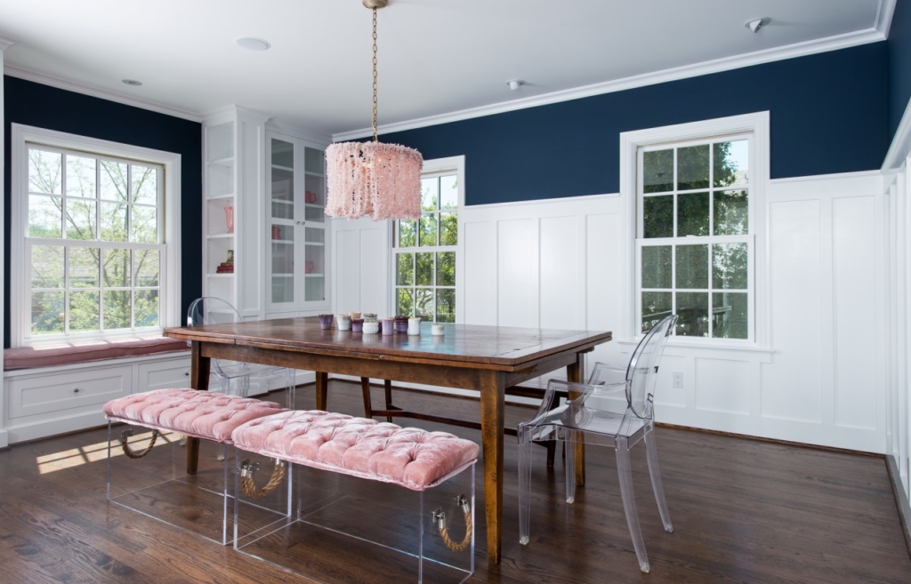
Wadden is calling for “a trend toward bolder, deeper colors, accented with a touch of opulence” in the coming year. So for 2020, Sherwin-Williams named Naval, a deep, rich blue, as its Color of the Year. Wadden is hopeful that homeowners will begin to embrace color, from blues to greens. She’s also seeing Sherwin-Williams Ripe Olive and Dard Hunter Green as popular choices for 2020 and beyond.
Naval is a departure from last year’s Cavern Clay. With its hint of terra-cotta, Cavern Clay is a color that meshes well with traditional sandy neutrals. The shift to Naval is a reflection of changing times, socially, and a sign that society may be done with safe neutrals—at least for a little while.
“Our annual Colormix Forecast reflects key influences in pop culture, fashion, design and technology, which are constantly evolving,” Wadden explained. “Last year’s forecast was inspired by free-spirited wanderers and old-world storytellers, while drawing inspiration from every corner of the globe. … 2020 is all about wellness and slowing down to take our best selves into the next decade.”
BOLD BUT VERSATILE
The vibrant new colors bring creativity and some risk-taking, but not necessarily recklessness. Many of the newer colors, such as Sherwin-Williams’ rich blues and greens, also have a grounding effect to them.
Even though it’s considered a bold color, Naval doesn’t need to be relegated to accent wall duty, Wadden adds. It can play a starring or supporting role by offering a restful tone in bedrooms while its statement-making side can be seen on cabinets or on an entryway accent wall, or even the front door. The color could also work well in entryways and front door alcoves for units in multifamily environments for a “welcoming effect.”
Naval also balances well with warm metallic accents like golds and silvers. And colors like Sherwin-Williams Kale Green, along with natural fibers in a room, also “play up [its] down-to-earth presence and create an increased sense of calm,” the color expert emphasized.
Whether your customers embrace bold color choices in the coming year or not, it’s important to understand that this shift is in the works. Making a mental note or having photo examples of projects where customers have taken the bold route could help new prospects still weighing color options feel more comfortable with their decision—and potentially help you land the job.
For more articles on color selection and other topics that affect painting contractors, visit inpaintmag.com


