
Avoid the color crisis with your customers
 As a painting contractor, helping your customers select the ‘right’ paint color can be a tricky proposition: get it right, and you’ve provided a helpful additional service; miss the mark and you’ve made an unprofitable investment of your time and possibly risked an unhappy customer.
Fortunately, there are a number of readily available tools and resources, as well as approaches to the color conversation, that can help you guide your customers in making a selection with confidence.
ASK THE EXPERTS
One of the most popular resources for color and design tools and services is your local paint retailer. Along with having a seemingly unlimited number of palette options from manufacturers, many stores have in-house color consultants, or can direct you to reputable ones in your area.
In addition to assisting your current customers, aligning with color consultants might also lead you to potential new business down the road.
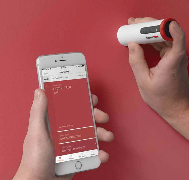
ELIMINATE THE GUESSWORK
If your customer has a color in mind but can’t determine exactly which white, blue or magenta they want, color readers can help. Color readers not only help in color identification, some also allow you to share color selections and palette ideas directly with your customers and keep a record of colors for each project.
COLOR CONVERSATION STARTERS
For customers who are really struggling with color, you can help get the ball rolling with some color conversation starters that can help them tackle the decision-making process from a new angle and feel more confident in their choices:
Consider the entire house. Encourage your customers to look at the flow of their house and consider how that influences choices. Does one room transition seamlessly into another? Is another room visible from one room? If so, you’ll want these room colors to work together. Using shades and tints of a core, base color is an easy way of ensuring color cohesiveness. As a general rule of thumb, interior house colors should be limited to no more than five core hues, with additional tints and shades of those colors.
Focus on the fixed. Begin the color-selection process by identifying the fixed colors in a room; the flooring, rugs, furniture, cabinetry and, sometimes, appliances. The right wall color can pull room elements together for a finished look. A color reader can help streamline the process by providing an instant reading of a color from a surface and suggesting complementary hues from which to build a palette.
Break color down. While it may sound over the top helping customers understand undertones can lead to harmonious color choices. Paint colors are a blend of hues—there is a mass color and an undertone. The mass color is the color you first see. The undertone is the underlying hue. The closer an undertone is to a mass color, the truer the color. For example, magenta has a mass color of red with a blue undertone. To determine an undertone, compare the color to a pure example of the hue. Choosing colors that have similar undertones will ensure that they’ll work well together.
Take color for a test drive. Use large paint-sample boards instead of painting small swatches of color directly on the wall. This will ensure a truer color rendition, plus allow you to move the boards easily throughout the room to determine how the color will read in corners, different lighting conditions, etc. Be sure to use the type of paint finish (matte, semigloss, etc.) on your test samples that you intend to use for the actual job since sheen can also affect how the color shows.
Show them the ‘light.’ Many customers aren’t aware of how light influences the appearance of color. Educating them on metamerism—the phenomenon of color seemingly changing hue under different lighting conditions—can help them avoid surprises such as seeing that the shade of taupe they loved in the light of day isn’t the same hue under artificial light in the evening. Some colors are more prone to metamerism than others, such as taupe, tan, lilac, gray, gray/blues, mauve and celadon.
Get familiar with a color wheel. It’s a great tool to understand how colors work together. Along with colors being organized into warm-, cool- and neutral-temperature groupings, colors can also be organized into schemes that help you pair them in a balanced way. You can create palettes that are calming, energizing—or a balance.
Color is just one aspect of a successful paint job. Offering great tips on color choice considerations can help demonstrate your professionalism and add to the overall experience for your customer.
PRO TIP
Tristan Hamberg, president of Refined Painting Services, says he considers versatility and coverage when he speaks to customers about color. “The current trend of brighter whites for walls can be challenging as far as coverage is concerned. I’ve advised customers that going with such hues can require an extra coat or two of paint, depending on the white selected. In these cases, I’ll have the pigment adjusted at the paint store to provide better coverage.”
__________________________________________________________________________________________
 Susan Bunting is the director of marketing, consumer solutions for Datacolor. Having 10-plus years of experience in the paint industry, where she built programs for pros, enables her to help contractors find new ways to grow and differentiate their business.