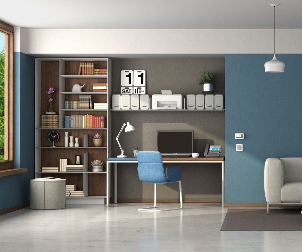
Color strategies for defining spaces in today’s multi-purpose home
 Without question, the COVID-19 pandemic changed our relationship with the space we call home. Almost overnight, the places we used to simply retreat and retire were transformed to also include makeshift offices, schools, gym—and in some cases—our new favorite pubs.
Even now, with work-from-home orders being lifted, it remains more important than ever to define the spaces in our home for the different activities now taking place there. While installing walls and doors are an obvious solution, they’re not always practical or affordable. Enter the role of color in defining space.
Using color to create comfort and connection
According to Sue Wadden, director of Color Marketing at Sherwin-Williams, the most important part of helping customers choose color for their home is making sure they feel a connection with the colors. The color expert shared her own recent experience with helping a friend who wanted to do a color update.
“She had no idea where to begin,” said Wadden. “I advised her to look around her home and find something she really identified with. She ultimately chose a seaside picture. From that, we developed a palette of five colors to be used throughout the home. It became the anchor we referred back to again and again, and it gave her the confidence to make selections that she had been too overwhelmed with options to make before.”
Wadden notes that, in some cases, the initial color choice will be driven by static items—carpeting, a large piece of furniture, etc. “In those instances, you want to match the color tone and build your palette from there. Very often, I’ll suggest people choose a color then go to Pinterest and do a search for that color and combinations.”
Creating cohesion, not chaos
While suggesting working within a palette will help keep customers from requesting jarring color combinations, Wadden offered a couple of tips for making the most of the available selections.
“First, make sure your customers understand that a paint strip is not a challenge to use all the colors offered,” she added. “Applying five different colors in even a very large open-concept space can start to feel overwhelming. For most open-concept areas, you want to aim for three hues.
Second, any abutting colors should be in close proximity to each other in a palette—no more than two to three shades apart. Transitions should be subtle. The one exception I would make is for any type of feature wall—maybe a large fireplace or built-in bookshelves. Something of that prominence can hold up under a bolder color and not feel misplaced.”
Off-the-wall ideas
If customers are hesitant to take on a major repaint or are shy about introducing more than one color to a wall or area, Wadden suggests pros consider two other surfaces: ceilings and doors.
“If a customer doesn’t want to change the color of walls between rooms but still wants to define different use areas,” said Wadden, “painting the ceiling in one of those areas the same color as the walls is a great option. You’re not changing hues so it’s seamless room to room. But the warmth the added overhead color brings can really change the vibe.”
Similarly, if they want to break up the monotony of a single-color space, painting doors in different colors from the chosen palette can achieve that, added Wadden.
Playing it safe
Regardless of whether a customer is doing a complete repaint with five colors or just trying something new on an accent wall, Wadden always encourages getting ‘wet’ samples (smaller quantities of paint that allow you to paint part of a wall to see how the color really looks in that space before investing in larger quantities). “There’s nothing worse than someone saying, ‘I hate the color’ at the end of a job—even if they chose it. Wet samples are worth the minimal added time and expense. In the end, they can ultimately save the customer money, and save you a lot of time and frustration.”
More articles for painting professionals can be found at inpaintmag.com

