
Colorful Business
 When you’re hired for a commercial or residential project and the client looks to you for advice on choosing paint colors to enhance the impact of the architecture, are you confident about your recommendations? We asked three renowned architectural color consultants in the U.S. for their guidance on how to select the best paint colors for a particular job.
Here’s a quick look at who they are and some specific examples of how they’ve made color work for them and their clients:
• Jill Pilaroscia, Colour Studio (colourstudio.com)
“I think you have to be obsessed with architectural color to become a consultant,” says the owner of Colour Studio in San Francisco, CA and an accredited member of the International Association of Color Consultants/ Designers–North America (IACC-NA). “You have to understand the human biological response to color and how much we’re affected by color and light.” And, Pilaroscia said, it’s important to recognize that every geographic area has its own intrinsic color palette, impacted by geographic conditions and their influence on light and color.
• Elizabeth Brown, EB Color Consultants (eb-color.com)
Design education, experience working in retail paint design, and “further intensive color study through the IACC” are what propelled Elizabeth Brown of EB Color Consultants in Seattle, WA into a successful career. But “it’s each renewed experience on the job that really prepares you [for this profession],” said Brown, an associate member of the IACC-NA. “What my colleagues and I seem to have in common is keen discernment of the elements of color and knowledge of how color can manipulate a space.”
• Amy Wax, Your Color Source Studios (yourcolorsource.com)
The former president of the IACC-NA and owner of Your Color Source Studios in Montclair, NJ, Wax says the single most important characteristic of a successful color expert is an instinctive understanding of color. “Applying color should take into consideration the style of the architecture, the period in which it was built, the lighting, the environment, the paint product and, most importantly, the people who will be living (or working) inside.” Part of the challenge, she added, is to balance those elements with respect for the original architectural design and not overshadow it with too much color.
COLOR AS THE SOLUTION
According to Pilaroscia, questions that can prompt the best selection of colors to enhance the architecture, especially for a commercial project, include: 1) What are the strengths of the architecture that the client wants to play up? 2) Which characteristics of the architecture does the client want to play down or diminish? 3) What does the client want to achieve with the project—increase leasing activity? Make the building more attractive for sale?
Be mindful of the balance (or lack thereof) of the architectural elements that are part of a home or commercial building, Brown said, along with the building’s size and orientation. In addition to enhancing architectural elements, Brown said, “the proper use of color can camouflage ugly and unnecessary elements. It can visually extend a roofline or seemingly alter the size and shape of a building.”
COLOR AT WORK
Adding contrast is one of the simplest ways to emphasize captivating architectural elements, Wax said. For a recent residential project (A), she incorporated two shades of a grayish green—a lighter tone (Benjamin Moore Cheyenne Green 1502) for the ground floor, and a darker tone (Benjamin Moore Trailing Vines 1505) for the upper floor—on the exterior of a beautiful, classic, two-story home in Montclair, NJ (B). She chose a deep red (Benjamin Moore Country Redwood PM-16) as an accent color for the windows, surrounding them with a creamy white trim (Benjamin Moore Navajo White OC-95).
The color palette specifically designed for this home draws attention to the architectural detail in a creative way, steering the design away from a traditional Tudor color palette (Tudor brown and off-white), Wax explained.
“The goal of this design was to create a color palette that gave the home a new identity. Brightening the trim and accentuating the architectural elements revealed all of the hidden charm of this home.” The pop of color around the windows and on select pieces of trim add a whimsical influence and call out the architectural details that, before, were hardly visible, she added. “Bringing out all of the details restored the Victorian charm this home once had,” she said.
For another residential project, Wax was asked to reclaim the beauty of a stately older home in Montclair. The weathered surface on the exterior presented a challenge for Wax because the aged, stucco-like finish could not endure a power washing (C). “Sherwin-Williams recommended a product that could be applied to the home without compromising the exterior surface material,” Wax said.
“This is a home without a lot of architectural detail, so I used the selected colors (SW 6185 Escape Gray, SW 6088 Nuthatch, SW 6084 Modest White, and SW 6069 French Roast) to accentuate the warmer wood tones of the environment and roof and add a friendlier appeal.” She recommended cutting down the bushes on the left of the house and accentuating details by adding more color to the windows and window trim (D).
“The lighter and darker browns added more charm to the home with understated details,” she said. “I also added more detail to the area surrounding the front entrance with contrasting white molding to bring focus to the center of the large home and create more curb appeal.”
ADDING VISUAL INTEREST AND INCOME
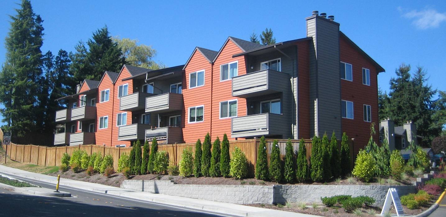
Brown consulted on an apartment project (E) in Seattle, WA whose original exterior color was so drab that, “it looked like a prison,” she said. “The clients wanted high visibility to attract tenants. I suggested color blocking with bold, warm colors.” The result: “A monochromatic apartment complex was brought to life with not only color, but also rhythm and lyricism.”
Brown incorporated contrast with Benjamin Moore’s AF-235 Warmed Cognac, Sparrow AF-720 as the secondary body color, and Silhouette AF-655 for the trim (F).
For another residential project, Brown used color to visually rearrange unbalanced elements. “This is a home with cool architecture whose original colors had been applied by the builder.” She was hired by the homeowner because the original flat-brown and faded-yellow body colors, along with a stark-white garage door (G), “were driving the homeowner nuts,” she said.
She replaced those colors with a warm/cool combination of slate gray (SW 6250 Granite Peak) as the main color, a taupe gray (SW 2841 Weathered Shingle) as the secondary color, and an off-white (Benjamin Moore OC-9 Ballet White) for the trim, which included the window casings (H).
COMMERCIAL IMPACT
According to Pilaroscia, “Color is a great return on investment with a commercial project. It adds value to a building’s scale, shape, form and volume.”
With that thought in mind, she took on the task of color consulting for a client that manages three Class A office towers in El Segundo, CA. The buildings, built in 1984, had a conventional-looking, predictable block facade that did not distinguish them from other similar buildings. “The clients wanted to reposition the buildings to attract technology tenants, while not offending any of the current tenants,” Pilaroscia said. “The clients wanted to keep the existing tenants while attracting new ones. They asked us to create an impact for maximum return on investment.”
Pilaroscia created a quilt pattern within a repetitive grid of window and panel frames (I). She tapped five shades of blue mixed with white and silver, and incorporated three different types of window glazing. “The shades of blue look good with the surrounding sky,” she said. “We chose the colors to work with the dark window openings, to create texture on the building, and because blue is a popular color with many people.”
The project received an Award of Excellence at the 2015 Los Angeles Architectural Awards.
With another project, Pilaroscia was asked to develop a color scheme for a Class A commercial office building adjacent to the famed Moscone Center in San Francisco. The objective was to make the building more attractive to potential buyers and to attract technology tenants, Pilaroscia said.
Originally, the building had repetitive arches and was painted all in beige. “It was unremarkable and no one noticed it,” Pilaroscia said. “We gave the clients many options for color, from conservative to artfully crafted solutions. They surprised us and went for an unconventional, yet well-designed, color solution.”
The paint job relied on a palette of bright white with vivid blue, green and white alternating around each window alcove (J). The building sold for $110 million, well over the asking price.
TAKEAWAYS
Each of the color experts has advice for painting contractors who are expected to provide paint-color recommendations that will highlight the best architectural features of a structure.
From Amy Wax: “Choose colors that complement architectural details rather than covering them up with colors that are too bold. That will always be a better direction than using colors that may overshadow the design.”
From Elizabeth Brown: “Choose a color that walks the fine line of not being oversaturated for a large application, yet is robust enough to give it some interest and vitality.”
From Jill Pilaroscia: “Identify the client’s goals and then provide a color sample in a clean, neat area that’s not distracting and connects with another part of the construction—a corner, a window or a door. Don’t apply the paint in the middle of a wall and let it float. Stand way back and look at it almost as if it were a streetscape.”
Any singular color can become boring and monotonous, Pilaroscia said. “There is a biological and visual response to color. If there is no visual or cellular stimulus, the body-mind relationship will be diminished,” she added, referring more to interior environments than exterior environments.
“The eye is always attracted to edges and contrasts, and this fact helps us discriminate between colors. In order to use color effectively, one needs to consider color light and darkness as well as color intensity.”