Colorful choices
 Many times, painting contractors are asked to suggest interior colors for both residential and commercial clients. Here’s some simple advice: to maximize the impact of architectural elements, consider contrasting paint colors.
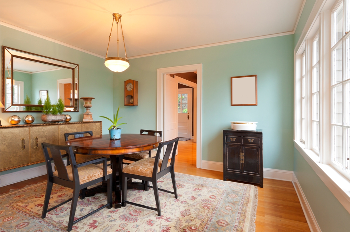
Jane Earl, a color consultant in Madison, WI, and an accredited member of the International Association of Color Consultants/Designers–North America (IACC-NA), suggests a color combination such as Sherwin-Williams’ Keystone Gray on a main wall with Sherwin-Williams’ Cruising, a rich blue, as an accent color around a fireplace, for example.
Earl also suggests using paint colors with higher light reflectance value (LRV) in darker areas and lower LRV in well-lit areas. A color with a higher LRV similar to a lower-LRV hue used in the main part of a room can be used to highlight an area where more light is needed. For example, Behr’s Mushroom Bisque, with an LRV of 48, pairs well with Behr’s Basketry, which has an LRV of 38.
“Different shades, tones and saturation of the same hue will completely change the look of the space and evoke various emotional and, ultimately, physical reactions,” advises Karen Collins, interior designer and color expert at JBA Architects in Newark, OH, and president of the IACC-NA.
Other principles of interior-color selection can be helpful to a painting contractor, too. Earl offers the following advice:
1) Keep in mind that most humans can’t look at color and remain neutral in their psychological response. It’s important to determine what kind of response the client is trying to elicit with color in the environment, whether it’s to feel relaxed, excited, motivated or cocooned. “Also, the right choice of color can make a room feel as much as four degrees warmer or cooler than the actual temperature,” Earl said.
2) Suggest a ‘thread’ color that can be used throughout the interior environment and then easily paired with an analogous, complementary or monochromatic color scheme in each room. “The thread color creates continuity and allows more variety in colors without being overwhelming,” Earl said. A warm yellowy, golden shade, such as Hallman Lindsay’s Marshmallow Mist, or a muted, complex taupe, such as Sherwin-Williams’ Mega Greige, can be a perfect thread color.
The thread color shouldn’t be too pastel, because that could end up looking white. While some mistakenly think white is a neutral color, “it’s actually not a color that people are psychologically comfortable with or can settle into.” And, Earl said, framed art always looks better against a colored wall rather than a white one.
3) Don’t limit an accent color to just one wall in a room. “A single accent wall stops the eye,” she said. Ideally, at least two surfaces in a room will have an accent color.
4) Consider the client’s personality when recommending a palette. “Extroverts need external stimulation to reduce stress; introverts need a quieter environment,” Earl said. “Clean, brighter colors may be more appropriate for an extrovert while more complex, muted tones are often better for introverts.”
5) Bring along paint manufacturers’ brochures showing various color combinations, so the client can see how colors work together.
If you’re still not certain, bringing in a color consultant can save both you and your client time and money,” she said.