
Tackle color suggestions in hip office settings
 Today’s workforce demands offices that bring a balance of amenities that make you feel at home but also stimulate the soul to do a great job. This can lead to some completely out-of-the-box thinking. A Google office in England, for example, offers personal gardens, a Hobbit Hole seating area, and some cushy spaces that look more like bedrooms than boardrooms.
Okay, so this is the extreme. However, if you are one of those paint pros with the opportunity to land office work that pushes creative limits, at some point, you may be asked the very loaded question: what would you suggest for this room? It takes a nimble type to navigate these situations, so keep these tips in mind while you fake it ‘til you make it.
THE HIGH CEILING
Dee Schlotter, PPG Paint’s senior color marketing manager, has seen her share of crazy office environments. Actually, she is a student of them. Today, she commonly finds open collaborative spaces geared toward creativity. Millennials love these spaces, even crave them. With open environments, designers will opt for higher ceilings, if possible. Schlotter offers the following tip for paint pros giving color advice.
“When you have big, tall ceilings, you should go more neutral, except for small areas. Beams could be accent places. … Millennials like the subtle grays, blacks and whites; it’s kind of a release from being so engaged online,” she explained.
ACCENT PREFERENCES
Schlotter also offers the following tips when it comes to accent colors that bring a little pop to a space.
Red: Red was a hot accent color for a long time, but it brings one small drawback. Some say it stimulates appetite, Schlotter warns. Use it in small doses, “but red is still absolutely a powerful color. It makes you feel strong.”
Blues: Blues can be inviting and engaging and foster peer-to-peer connections. Schlotter recalled a research study she read where two bars, one painted predominantly red and another blue, were analyzed for how patrons used the space. “More people went into the red bar, but people stayed longer in the blue bar,” she added.
Greens/Purples: Some office designs have more windows and seek to invite nature, even give a sanctuary-like feel. Schlotter looks to green and purple accents for these spaces. “Some companies even want spaces for meditation; you want that soft color … the greens and violets,” she noted.
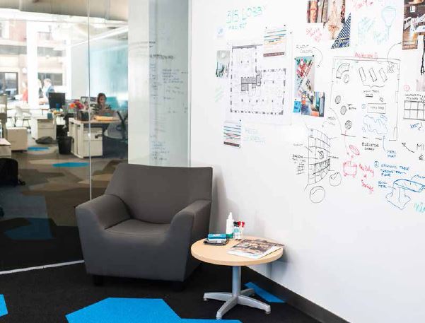
WHITE BOARDS, WALLPAPER
Rick Williams, VP of Williams Professional Painting in Alexandria, VA, is seeing more and more requests for whiteboards in office spaces. With an entrepreneurial spirit encouraged by certain companies, some rooms may look more like lounges with entire walls full of whiteboards. Williams looks to IdeaPaint formulas for these spaces.
In busy hallways, more architects are also requesting commercial vinyl wallpaper, Williams noted. It brings durability and a no-touch up factor. Although there are some limitations to wallpaper as well.
“No matter how durable a paint is you’re still starting a maintenance cycle,” he said. “However, wallpaper is great for longevity, but it tends to go in and out of style, too.”