Tackling color suggestions for customers selling their home
 Most homeowners know a paint refresh is a must when it’s time to sell their home, so paint pros are often asked to make color suggestions when they take on these jobs. Experts at application techniques and choosing quality coatings, some pros can feel out of their element offering advice on color. Here, Erika Woelfel, VP of color services at Behr, offers a few tips in these situations.
EXPLAIN THE ‘WHY’ BEHIND SUGGESTING NEUTRALS
Going with neutral colors has been a long-time suggestion when putting a home on the market—and for good reason. People want to envision their own belongings in the home and do a little mental decorating as they walk around. That’s hard to do when a large vibrant-orange or fire-hydrant-red wall begs for attention.
“Simple, neutral tones are highly favorable for creating welcoming and versatile environments, regardless of a room’s size or natural lighting,” Woelfel added.
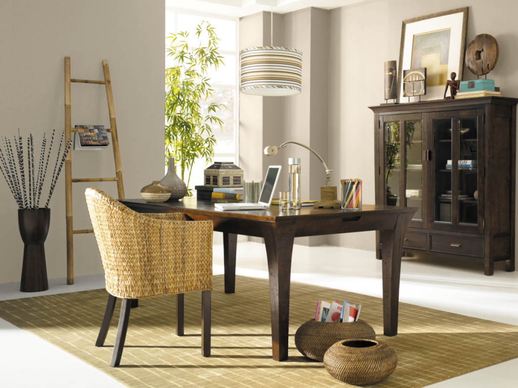
For interiors, the color expert suggests earth tones, such as Behr’s White Metal, a soft gray, and Creamy Mushroom, a light tan. These colors settle into the background nicely and allow you to highlight the room’s best characteristics—and they allow the buyer to do their dreaming.
For exteriors, she recommends light neutrals that keep a home looking clean and inviting. Behr’s Weathered Moss and Jungle Camouflage are silver tones that welcome—and don’t overwhelm—as the buyer makes their way from the curb to the front door.
WHAT TO AVOID
Avoid colors that are “too distracting, dark, sterile or over-saturated,” Woelfel adds. So, you might reconsider suggesting a deep, dark blue for a large entryway wall that can make the space look small and overwhelmingly dark. Encourage your customer to get pops of color from accent pillows and small furnishings instead of a wall of a dominating color that could overtake a room.
“Stick with classic paint colors that have longer trend cycles, and that appeal to a wide range of tastes,” Woelfel suggested. “They adapt to fit most decor styles and needs.”
CONSIDER THE COVID-19 INFLUENCE
The color expert also says the COVID-19 pandemic has had an influence on residential design, which may filter through to color preferences as well.
Because of greater at-home work and academic needs, interior layouts favor enhanced home offices, she explained. These shifts could lead to homeowners gravitating toward “more neutral, dependable, versatile colors that will stand the test of time.”
But that doesn’t mean you can’t add a little character, too. As examples, Woelfel points to colors such as Behr’s Jojoba, a light-green, or calming blue Voyage.
“These hues can positively enhance moods throughout homes and spaces … and are reliable go-to suggestions for the paint pro because they can adapt to just about any personal style, space or purpose,” she added.
For more articles on recommending paint colors to customers, visit inpaintmag.com
And for a recent article on how a paint manufacturer’s service offerings are helping the pro amid COVID, click here.