Trend Setting
Paint manufacturers’ color marketing experts who, every year, identify paint color trends, wear more hats than you might imagine. They’re well-versed in social science, demographics, pop culture, technology, spirituality, art, and even weather patterns—because these create or influence societal trends. It’s those trends that they then try to translate into color.
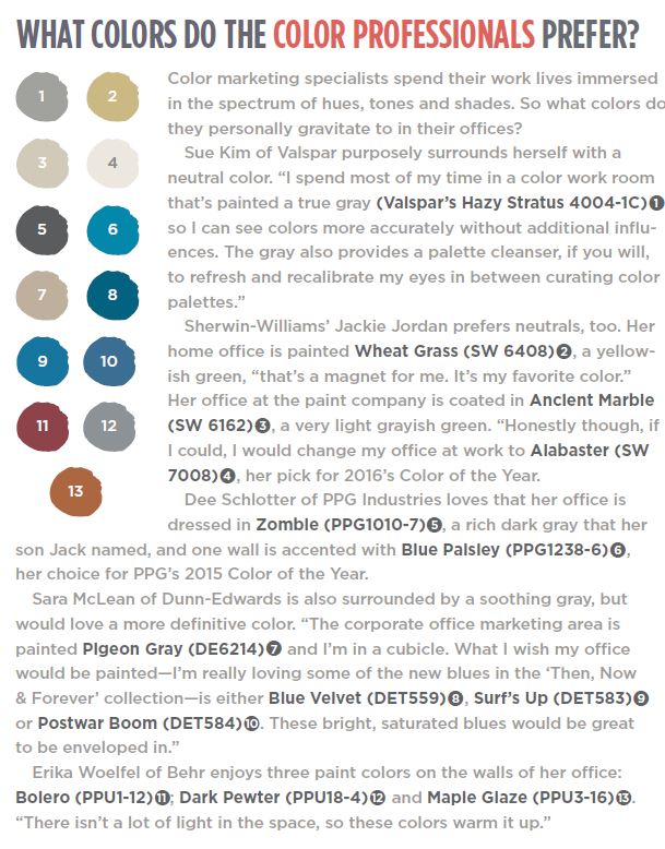
These color specialists develop new color-trend palettes annually to generate buzz in the interior design community and feed consumer passion for the latest and greatest.
WHY THIS MATTERS FOR PAINTING PROS
“Some painting contractors have more interest than others when it comes to color selection,” said Jackie Jordan, the director of color marketing with Sherwin-Williams. “But no matter their interest, having some level of knowledge about the newest trend colors helps them become a trusted resource for their customer. Including color information on their business web site can guide customers and assist with how they speak about color with their customers. Staying on top of industry trends shows that they care and are willing to take that extra step to research what matters to their customer. This can help contractors attract repeat and referral business.”
WHERE COLOR INSPIRATION COMES FROM
“We get inspiration everywhere,” Jordan said, “whether it’s from a cultural or art movement, national and international trade shows, hot travel destinations, or nature. We scour the globe to find those things that are resonating and driving color in new directions. We have subscriptions with the world’s leading trend organizations that provide us with think tank conversations that cover topics such as the economy, science and technology, innovation, and trade show reports. We also read countless blogs and web sites looking for the unusual, or a new movement that may influence our color selections.” Erika Woelfel, the VP of color marketing for Behr Process Corporation, finds inspiration in fashion, annual workshops held by the Color Marketing Group (the international association whose mission is to create color-forecast information for color-design professionals), DIY blogs, interior-design web sites such as Houzz.com, and social media sites like Pinterest.
Dunn-Edwards Paints’ Color Marketing Manager Sara McLean said inspiration comes from travel; restaurant and art gallery openings; exhibitions that spotlight architecture, furniture, fashion and product design; movies and television; world events such as the Olympics; robotics; and socioeconomic shifts.
TRANSLATING TRENDS INTO COLOR
“Color trends are designed with two things in mind —the lifestyle of today’s homeowners and how we, as a group, connect to color emotionally,” explained Sue Kim, a color strategist with Valspar Paint. “When we observe trends and cultural influences throughout the year, we’re constantly translating them into sentiments. When we’ve identified the most prevailing current cultural movements, we assign a set of descriptors and adjectives, and curate a mood board of inspirational imagery that embodies the aura of the trend. We then align the visuals and words with the color personalities and assign hues accordingly.”
Pictures that illustrate trends can be key to converting those trends into color, said Dee Schlotter, senior color marketing manager with PPG Architectural Coatings. “What’s happening in society translates into the colors that show up everywhere—not just in paint, but in fashion and home decor,” she said.
THE PROCESS OF CHOOSING COLORS
The process varies among companies, but most create multiple high-concept themes targeted to the design community. Each theme has its own paint color palette, reflective of a variety of trends. There is at least some commonality among most of the manufacturers’ themes.
Some of the paint companies, like Sherwin-Williams and PPG, identify a single stand-out color among the dozens of paint colors they tap for the year’s design palettes. Others, including Behr, Dunn-Edwards and Valspar, don’t pick a lone top color. But in every company, the process of developing color-trend palettes is multifaceted and thorough.
PPG organizes a three-day meeting for its 20 international color experts to analyze design trends, consumer preferences and priorities across regional, cultural and global markets to determine factors that will influence future color choices. Color styles from multiple industries are considered, including automotive, architectural, aerospace, and consumer products markets.
On the first day, each expert presents a year’s worth of preparation, mood boards, magazine cutouts and Pinterest boards for inspiration. Their color ideas are based heavily on cultural and demographic trends from their region and market.
By the third day, final color-trend selection and refinement is at hand. The color stylists collaborate to define the overarching idea behind each color-trend palette and debate the Color of the Year.
The trend-forecasting process at Valspar, “starts with searching the topics that impact consumers’ lives and inspire new projects,” Kim said. “We use a little bit of art and science to gather a range of colors to ladder up to the emotions associated with the story.” Then, she said, “with a lens of livability for the consumer,” they pare down to a, “cohesive collection of easily understood colors.”
EDGY, CONTEMPORARY THEMES
Almost always, the result of the research is a trend report wrapped around the selected colors.
McLean developed five themes for Dunn-Edwards’ 2016 Color +Design trends report. The themes emphasize vintage romanticism; simplicity and authenticity; exotic travel and street entertainment; playful family vacations; and a mix of digital and spiritual interests. A palette of 10 to 12 colors is linked to each theme.
For their latest forecast, entitled 2016 Global Color and Design Trends: Odyssey, PPG’s color experts generated four distinct themes and palettes that focus on celebrating unique, yet flawed, beauty; the digital, powerful and unconventional consumer; growing consumer interest in stress-free, mindful living; and a desire for more protection and privacy. For each theme, the team chose a palette of 22 or 23 colors trending within it to fully represent the trend.
For Sherwin-Williams’ 2016 Colormix forecast, a collection of hues selected from among hundreds of the manufacturer’s paint colors, Jordan also developed four themes: renewed emphasis on health and wellness, natural healing and unplugging; rediscovering the enjoyment of in-person social engagement; an appreciation for quality craftsmanship and small-batch production; and new technologies and space-age materials that create endless possibilities for the future. Six to 10 colors have been selected to represent each theme.
Behr’s Woelfel created four themes for their Trends 2016 that capture an appreciation of contemporary residential living: blending bright colors with dark tones to activate the senses; luxury spaces that feature gold detailing and geometric patterns; classic homeyness with subtle color combinations; and warm, inviting spaces with bright lighting. Five brand-new colors are part of each theme. “Each year, the trend colors are special limited editions,” Woelfel said. The idea is ‘get trends while they’re hot.’”
Valspar’s conclusion is a bit different. “We see the color trends in a continuous movement rather than an abrupt interruption,” Kim said. “We focus on how the colors shift in tone and shades that represent lifestyle, rather than changing colors just to be different for the following year.” Valspar’s 2016 Color Trends offers four muted mid-tones to counter-balance busy living; essential grays that pair with almost everything; crisp brights; and rich, artisan tones. Six coordinating colors are associated with each trend.
CONFIDENCE IN COLOR
Most color managers don’t gut-check their color selections with focus groups. “We don’t vet the color with professionals and consumers after we make the final selection,” Jordan said. We believe we have enough support and validation in our choice that we are confident in its appeal and application.”
“While we do a great deal of research on consumer insight,” said Kim, “we don’t conduct traditional consumer research on trend colors.”
“Each trend palette and the colors within it are carefully chosen based on characteristics revealed by the extensive research conducted,” Schlotter said.
COLOR OF THE YEAR?
Sherwin-Williams and PPG announce a Color of the Year, but Behr’s, Dunn-Edwards’ and Valspar’s color managers opt not to. “Behr purposely does not release a color of the year like some other paint companies,” Woelfel said. Instead, the 20 trend colors, “are hand-selected to be new and unique. The trend colors do not repeat from the Behr core palette or any other Behr collections at The Home Depot.
“I believe there’s so much personalization with color these days that it’s hard to name just one ‘it’ color for that year,” McLean of Dunn-Edwards said.
Sherwin-Williams announced its 2016 Color of the Year: Alabaster, (SW 7008), a soft white with faint warm undertones. “It provides an oasis of calm, simplicity, spirituality, and less-is-more visual relief,” Jordan said. “Alabaster is neither stark nor overly warm but, more exactly, an understated and alluring white.”
PPG announced its Color of the Year: Paradise Found (PPG1135-5), “a serious green that is nurturing as well as sturdy and protective,” Schlotter said. “It provides a sense of strength and organic energy reminiscent of militia style and natural environments.”
PPG also owns the paint brands Olympic Paint & Stain and Glidden; each has its loyal fans, Schlotter said. The Olympic Color of the Year is Blue Cloud (D48-5), “a celebratory blue that’s self-expressive and glamorous,” she said. Glidden’s Color of the Year is Cappuccino White (45YY 74/073), a “calm, sensitive, creamy neutral that creates a sense of delicacy and graceful design.”
MAKING SENSE OF THE RAINBOW
“I liken [having several colors of the year] to fashion,” Schlotter said. “There is always a big pool of colors that’s trending and there’s room for all of the colors of the year. There is a clear lineage from one year to the next in the evolution of the colors and, often, the trend stories themselves, too. Our trends are not fleeting colors or palettes; these have tenure. The colors and palettes chosen will still be usable three to five years or more from their launch so consumers need not worry that our trends will date themselves.”
“I don’t just change a palette for the sake of making it different from the year before,” McLean said. “Most likely, the colors shift to different undertones and values drop off, or come up on the radar through the research on trends. Overall, you do want color shifts to keep people interested in color and design. Colors and trends tend to cycle over the span of around seven to 10 years, so you’ll see some similarities or colors you remember but are modernized for today’s consumer.”