U.S. color preferences: 51 shades of gray—and peach, and green, and blue and …
 When it comes to color, beauty is truly in the eye of the beholder. That said, there are factors beyond taste—or lack thereof—that can influence an individual’s final color selection. One of the biggest can be location.
“There are a number of location-specific factors that tend to drive color choices,” says Amy Woolf of Amy Woolf Color Consulting in Northampton, MA. “When combined, those factors contribute to regional color trends that may vary slightly depending upon color trends, but don’t really deviate much over time.”
The first factor Woolf cites is the natural setting. “All you have to do is conjure up Seattle and Sedona in your mind to appreciate how much natural settings influence color choice. What works with soft desert hues and pastel sunsets does not work where the dominant natural elements are gray skies and giant evergreens.”
Woolf also notes that architecture drives color choices. “It’s important to honor the style of a home’s interior and exterior with your color choices,” she says. “You wouldn’t—or shouldn’t—paint a Federal-style clapboard home a vivid blue like you’d find in Miami. The architectural style and color would be at odds, and the resulting look would be disconcerting to the viewer.”
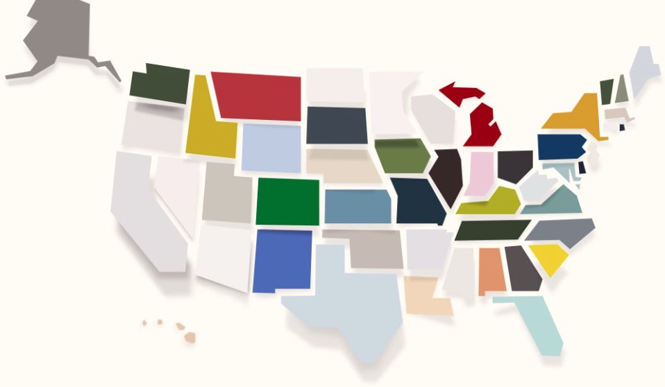
Because nature and architecture are fairly ‘fixed,’ it’s no wonder that there are strong regional preferences. Recently, House Beautiful tapped color consultants across the country to find out what’s trending in their home states. The map at top indicates how their picks color the country.
Woolf notes, “The popularity of neutrals isn’t that surprising. They’re timeless and safe, can range from cool to warm, and play well in every setting and with most colors. Even though neutrals may feel like a less-adventurous choice, there are many opportunities to find more exciting accents to pair with beige or gray; most notably, choosing a bold color for a front door.”
As for using regional preferences to help customers begin color selection, Woolf says, “For customers who don’t have strong ideas about colors, regional color trends can provide a good jumping off point. There’s comfort in going with what others have selected and knowing that you’re not going to be that out of sync with the architectural context of the area. They’re also helpful in gently reigning in customers who have maybe gone a bit too far afield in their selections. I don’t recommend discouraging anyone from pursuing a color, but if you think their choice is going to lead to unhappiness down the road, pointing to a regional feel may allow you to help them keep their color, but choose a tone that stands out for the right reasons.”
For more articles on how painting professionals can assist customers in color choices, visit inpaintmag.com