Boosting curb appeal with color
 Erin Marshall used to get irritated when she looked out the window of her kitchen in Portland, OR, and her gaze fell on the house across the street. “It was white and it just blitzed my eyeballs in the morning because it faces east,” she says. As an interior design consultant, white exteriors are a pet peeve: “Almost nothing in nature, except a brand-new flower, is white,” says Marshall, who owns Kismet Design. So when the owner of the white home passed away, Marshall approached the new buyer and offered her services to recommend colors to paint it. He accepted, and now it’s a soft, terra-cotta red with tan trim and a gray roof. It pops in a neighborhood of mostly neutral homes—and soothes her mood. Marshall also believes that the color boosted the curb appeal and helped the home sell quickly when it went on the market soon after. “If you’ve got a well-conceived palette on the exterior of your house, it sets the package,” she says. “It says, ‘I went to an effort to make my house sparkle because I want you to notice and remember it,’”—and I want top dollar for that.
Across the country, interior designers, color consultants and home magazine editors agree that when it comes to boosting curb appeal, a little paint can go a long way. “Color is the biggest bang for your buck,” says Brian Kramer, senior home design editor with Better Homes and Gardens’ special interest publications including Do it Yourself and Before & After magazines. “The right color, through paint, is the fastest, most cost-effective way to be the house that stands out.”
KNOW THE AUDIENCE—AND KNOW THE HOME
When advising clients on choosing color, it’s important that they consider the entire neighborhood, says Amy Woolf, owner of Amy Woolf Color Consulting in Northampton, MA. She advises clients to select a color that’s unique, but also harmonizes with the surroundings. “If all the houses on your street are beige and your house is electric purple, you’re detracting from the value,” says Woolf, who adds that natural hues such as brown, green and gray will often help the home settle into the landscape.
The style of the house should also influence color selection. “It’s important to honor the architecture,” she says. For example, she wouldn’t paint a Colonial saltbox house six or seven colors, “like a painted lady,” she says. Nor would she paint a Federal-style clapboard house a vivid blue when it would look better a pale white or pale gray.
Marshall, says that size should also inform color selection. For a larger house, she says she’d opt for a more conservative approach, like a darker-gray body color—common where she’s based in Portland. Whereas with a smaller house, a brighter choice like orange would pop. “You can be sassier because it takes up a lot less room,” she says.
When he’s scouting for homes fit for a magazine spread, Kramer says bold colors catch his eye. “It’s deep grays that are almost going toward black; it’s deep greens that are mossy to forest; it’s blues that are going toward a black, even as their accent,” he says. “And of course, with all that is a really nice, crisp trim.”
THINK IN THREES
Three is key when it comes to exterior colors, says Marshall: body, trim and accent colors. “You can pick two of the most boring colors on the planet and, with a third color, you can make magic,” she says.
With the body and trim, contrast is imperative, she says. “It almost doesn’t matter what color you pick, to an extent. It’s not necessarily about the hue, whether it’s red or green. It’s about the distribution of light and dark that is really the most important thing.”
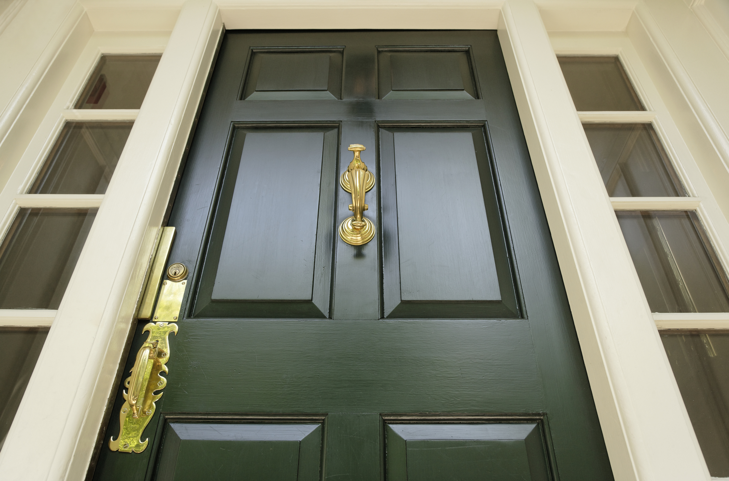
The accent color is where Marshall advises homeowners to flex their personality. “The door, in my opinion, should always be snappy,” says Marshall. “If you’re going to have a gray house, have a bright-red or bright-yellow door and make it glossy, because it’s easier to clean and it’s bright and welcoming.”
Marshall also lets clients know that accent color should appear in more than one place around the exterior, such as details around columns or flower boxes. “When you have a red door on a gray or white house, it definitely calls attention to the door. But what you need is some red flower boxes or a touch of red on your mailbox to take away from the randomness and to create rhythm and a sense of purpose,” she says.
A LITTLE GOES A LONG WAY
When painting, small touch-ups can make a world of difference, says Kramer. He lets readers know that simply painting the shutters and the door can make an impact.
One trend Kramer has noticed: using dark tones to emphasize a home’s architectural features, like window trim. In particular, he says he loves seeing shades of black applied to window trim of ranch homes from the ’50s and ’60s. “It looks like off-the-runway architecture,” he says. “And it’s done with paint.”
Woolf tells her clients that quick fixes—like updating the paint around the porch and front steps—resonate. “As somebody comes up the sidewalk, it sets the tone. If the paint out there is chipping and everything is looking ratty, that makes a bad first impression,” she says. Another pet peeve of hers: bright-white trim around the windows. Instead, for an update, she suggests selecting a light trim color that aligns with the color of the body of the house.
Marshall adds that an easy way to add value to the house is to make sure all of the windows have trim. She says she frequently sees homes where trim is just applied to the front windows. “If the rest of the windows of the house are not trimmed out, that should be the very first thing you do on an exterior. It will make the house look like it’s $10,000 more than everybody else’s house,” she says.
All three design experts agree that the key to advising clients on paint is finding balance, both for now and for the future. “What’s important is that colors are well chosen and balanced with the neighborhood, and trim color is appropriate, so when somebody looks at buying the house, it doesn’t scream ‘must repaint now,’” says Woolf.