Color trends 2018: what’s new, what’s next
 Each year, the major players in the coating industry tap into the country’s color consciousness to predict and inform design and color choices for professional customers. How they present those colors varies as dramatically as the colors they predict, from singular Colors of the Year to extensive multicolored palettes. Here’s a look, by manufacturer, at the colors you’ll be seeing in 2018 and the inspiration behind them.
BEHR
Erika Woelfel, Behr’s VP of color and creative services, is thrilled to announce the company’s 2018 Color Trends palette, a selection of 20 new colors the company predicts will command the home decor and paint industry in the new year. Woelfel says, “This palette is a reflection of the hues and styles both consumers and professionals will see in the coming months.” She notes that the company “… also introduced our first-ever Color of the Year, In the Moment T18-15, which is a tranquil, spruce blue.”
Woelfel says more and more homeowners make color decisions based on the mood or feeling they want a room to evoke. “For example, using light colors to open up a room and impart a sense of calm—or infusing bright, saturated accents to create a stimulating energy in spaces where you entertain family and friends,” she said. “This palette was created with that in mind. The four beautiful new blues work to create a sense of relaxation, and the selection of darker, more complex hues will feel protective. While the palette does include some more daring hues, it also includes subtle neutrals, such as Quiet Time T18-19 and Soft Focus T18-09, which may be more appealing to professional painters in search of versatile base colors.”
Speaking of versatile, Woelfel adds that In the Moment is a usable blue-green that works well in many different spaces, from front doors to kitchens to bedrooms, and even furniture.
Behr’s color inspiration? “Each year, our team is inspired by what’s happening in the world around us and how color comes to life in new ways—in fashion, pop culture, travel, the world of design, and more,” Woelfel said. “We spend months imagining a palette filled with colors that will reflect what’s to come, and attend conferences and home shows here and internationally to gain a deep understanding of what’s happening across the residential and commercial décor and design industry.
“This year, we were specifically drawn to lifestyle trends of awareness, mindful living, and the Danish concept of hygge—the feeling of cozy, comfortable conviviality and well-being,” Woelfel said. “People are organizing and decluttering to prioritize experiences over material items. They’re keeping only the things that make them happy, including using colors that bring them joy. We also take into account industry trends, professional preferences, and consumer likings to ensure our Color Trends are fresh and new. On the commercial side, we’re also seeing shifts as people begin to use their spaces differently, which has caused residential and commercial design to become more closely intertwined.”
BENJAMIN MOORE
The Color & Design team at Benjamin Moore literally traveled around the world in preparation for the company’s 2018 Color of the Year selection. Their journey took them to 12 countries, 30 cities, and more than 20 industry shows in search of points of inspiration from various industries, which included the arts, design, architecture, pop culture, fashion, and home furnishings.
Based on their findings, the team selected Caliente AF-290 as the 2018 Color of the Year. Said Ellen O’Neill, the company’s director of strategic design intelligence, in making the announcement: “It is the signature color of a modern architectural masterpiece; it’s a lush carpet rolled out for a grand arrival; the assured backdrop for a book-lined library; a powerful first impression on a glossy front door. The eye can’t help but follow its bold strokes.”
O’Neill said the company’s Color of the Year and Color Trends celebrate what the team identifies as relevant in interior design around the world. However, the use of the color in design varies from region to region—for example, whether the color is used on all four walls of a room vs. incorporating smaller accents.
“Caliente is a vibrant, charismatic red that has great coverage,” O’Neill said. “But it is worth noting that whenever you are making a drastic color change, use the suggested primer or foundation coat to ensure complete coverage. If no specific foundation coat is specified, a gray-tinted primer can help ensure a smooth transition.”
DUNN-EDWARDS PAINTS
Sara McLean, Dunn-Edwards’ color expert, says her company has embraced five major color trends/ stories in 2018, the first being highly stylized, and steeped in luxury and romanticism.
“Our trend story, Memories, highlights key past architectural and fashion eras trending again, including the Art Deco era, French fashion circa 1940s–1950s, and even baroque design,” McLean explained. “Memories’ colors are chic and sophisticated with notes of feminine baroque and French nostalgia. Blue-greens, lacquer red, dark-brown wood tones and bronzed caramel are lightened with touches of grayish pink and gold. Iridescent finishes add drama.”
McLean said the company’s second trend, Natural Wonders, focuses on back to basics, highlighting the health and wellness industry. “This color palette is sun-drenched and light-infused in a rich range of warm neutrals. Influences of casual springtime, seaside coral, and aquatic blue highlight the palette. Heathered, matte and softened finishes add natural depth.”
The third trend, said McLean, is The Stars, which features the influence of technology through virtual and augmented realities. “It is an exotic palette inspired by the natural-unnatural coloring of the technology world. Glossy pastels, 1980s retro hues and touches of street art color accentuate hot pink, dark blue, and a range of dense colors,” McLean said.
“Our fourth trend, which we call Adventures, provides a platform to highlight the continued trend of global travel and design, providing insight to creating a place filled with personal stories of adventures and lessons. Collections are from undetermined origin, creating a magical, luxurious Bohemian space.” McLean says those colors are dense, lush and exotic with fusions of emerald, red, amber and mystic purple.
“Under-the-earth color highlights include lava, volcanic rock, and gemstones. Deep, murky nighttime sky colors add depth,” she said.
The fifth, says McLean, is Childhood Joys, which is fun and simple with charming details, focused on making everyday life better and easier.
“This color palette is filled with chic, sophisticated basics and classics of navy, burgundy, gray and beige with near-primaries such as orange and green,” McLean said. “Scandinavian design influences, whether high-tech or natural, infuse strong details. Overall, it’s inspired by childlike atmospheres.”
PPG PAINTS
PPG’s Color of the Year might surprise some professionals, explained Dee Schlotter, senior color marketing manager.
“Professional painters may start to notice consumers’ increasing interest in untraditional neutrals like PPG’s 2018 Color of the Year, Black Flame (PPG1043-7),” Schlotter said. “This statement-making black is infused with an undertone of the deepest indigo, which evokes the privacy, hope and classic modernism that many consumers crave today.”
Schlotter notes that today’s society is facing overstimulation. Black Flame offers a comforting retreat, and a chance to start new.
“The color black is an anchor in design, meaning it grounds other complementing colors and decor items,” she said. “Whether it’s an interior door, trim, accent wall, cabinets or staircase, this black helps to provide that necessary color to make the room feel designed. This single color is the anchor color in the broader 2018 PPG Global Color Trends palettes, which encompasses four themes that connect and resonate with current consumer mind-sets.
Schlotter said Black Flame is a departure from the past, where there has been a vibrancy and whimsical annotation to key tones, but that black offers fortitude and provides a feeling of privacy and protection amongst a current feeling of restlessness. “It represents consumers’ collective somber mood; however, black is not necessarily a negative color; it represents strength and retreat, and is considered a power color.
“While black in decor is a bold statement that implies a bit of edge, at its core, black is a classic hue that pairs well with almost anything and adds sophistication to any space,” she said. “Pair this hue with trending copper accents, pale aqua velvet, clean marble, geometric patterns, or pale woods.”
SHERWIN-WILLIAMS
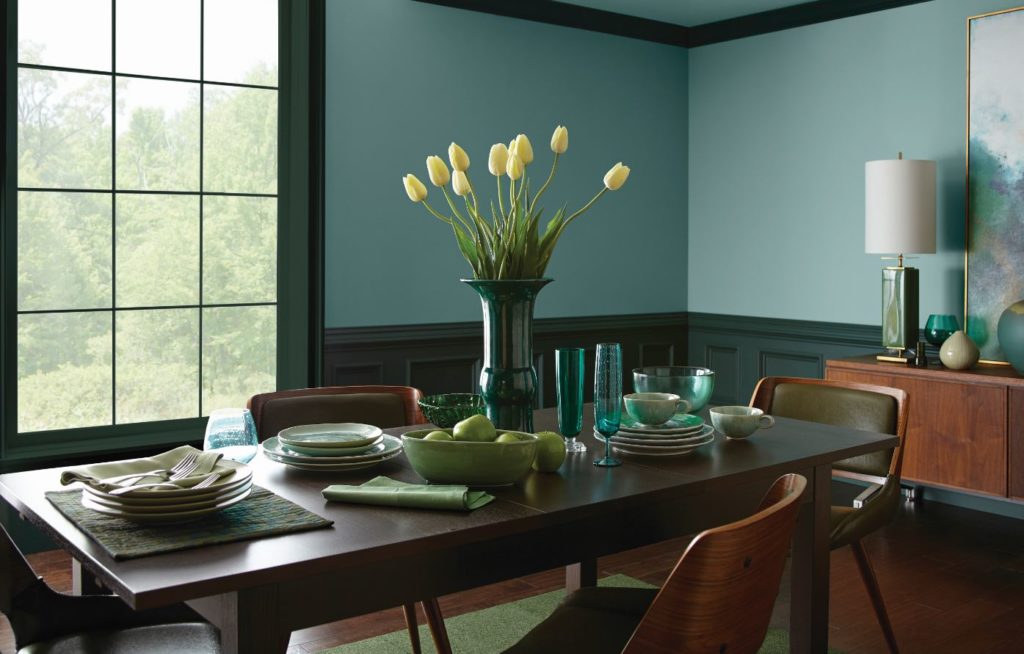
The roar of the surf gives way to the subtleties of the sea in the Sherwin-Williams 2018 Color of the Year, Oceanside SW 6496.
“Oceanside is a harmonious balance of blues and greens that can be found in what’s old and new,” explained Sue Wadden, director of color marketing for the company. “It is a perfect color for 2018, reflecting our growing sense of adventure and desire to bring that feeling into even the coziest corners of our home.”
Wadden and a global team of color and design experts traveled the world researching key trend drivers in home decor, fashion and design that helped determine the company’s Color of the Year.
“Oceanside’s multidimensional, marine-inspired look can create a welcoming statement as a lively color for a front door,” Wadden said. “Its green-meets-blue tone can also boost creative thinking and clarity of thought in a home office.”
PRO ADVICE
While some pros avoid participating in the color selection process, Schlotter thinks there’s a real opportunity to use color trends to help streamline the selection process and boost customer confidence.
“Pros can offer an added service to the customer by helping them select a color,” she said. “In suggesting trends or validating their selection by recognizing the ranking of the colors chosen, painters can offer valuable support to homeowners overwhelmed in the color selection process.
Wadden suggests, “In a kitchen or bathroom, help your customer achieve harmony by pairing traditional colors like white, black, navy and gray on cabinetry or fixtures with a gorgeous complementary color for the wall, rather than matching hues.” Schlotter adds, “And with the opportunity to draw from industry trend reports like the PPG Paints 2018 Global Color Trends Palette, painters can offer yet another level of expertise in the industry.
________________________________________________________________________________________
UNEXPECTED TREND
While color experts have a pretty good pulse on emerging color trends, on occasion, a breakout color takes them by surprise. For Erika Woelfel of Behr, the unexpected popular color is pink.
Woelfel said they’ve been most surprised by the increasing interest in mauve and pink shades over the past few years. “You’ve probably seen the surge in popularity of ‘millennial pink’ over the past year—it has miraculously become a sort of ‘new neutral!’ We’re embracing it, and included Positively Pink T18-01, a balance between rose and apricot, in the 2018 Color Trends palette.”