Putting Color to Work in the Workplace
 Without a doubt, color can have a big impact on how people respond to a space. From soothing blues and neutrals to bold reds and oranges, color can influence how people feel and how they perform in a space, both of which are particularly important when it comes to workspaces.
According to the International Association of Color Consultants/Designers (IACC), the right color choices can:
• Improve perception and protect the eyes from unnecessary strain
• Increase efficiency and minimize errors by reducing monotony, irritation and premature fatigue
• Improve orientation and increase safety
And, to some extent, compensate for specific problems such as noise, heat, cold, dryness, and more.
In short, color matters.
DRAB IS THE ENEMY
“People always worry that going too bright or too bold is the worst thing,” says Beth Burns, owner of Beyond White, a color and finishes consultancy in Virginia. “But to be honest, drab is the enemy, too. It’s not just unattractive; it affects people. They sit in a boring white or builder-beige space and there’s nothing refreshing or cozy; it’s just not inspiring or pleasant to be in.”
And although she’s a color consultant, color is not the first discussion Burns has with clients when starting a new project. Instead, she starts with an analysis and then goals.
“It’s important to understand the existing space and what the goals are for it,” she says. “Is it dark or well lit? Is it hot or cold? Are there lots of separate spaces to be defined or one cohesive area? Do they want the finished space to feel formal and even intimidating or do they want a fun and funky vibe? Ultimately, it’s a combination of what you need to overcome in a space and what effect you want to achieve that drives good color choices.”
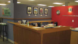
COLOR AS AN ORGANIZER
Elizabeth Brown of EB Color Consultants in Seattle, WA agrees. “Without a doubt, bland is bad. But so is color just for the sake of color,” she says. Brown likes to use color with purpose.
As she explains, “Color is great for organizing and anchoring space. Even in an open-concept design, you can use color to define spaces. Say you have a long wall and along it are a copy area and a kitchen. By using a different color in those areas—either on the walls or in the flooring—you give order to the space. That’s very helpful in making people feel settled, calm, and in control.”
GO EASY ON THE EYES
Karen Collins, an interior designer with JBA Architects in Newark, OH and president of the IACC-North America, says one thing that people often fail to consider when selecting color is its light reflective value (LRV).
“Especially in the case of offices where you have people staring at monitors all day, its particularly important to make sure whatever color you choose for the walls isn’t too reflective. It’s simply hard on the eyes and has a definite impact on employee productivity and general well-being,” she says.
When selecting wall colors, Collins strives for a midrange of 40% to 65% LRV.
She also cautions against using color incorrectly, as it can promote overstimulation. “If you notice on reality shows where people are forced to live in a house together,” she explains, “they use multiple colors and patterns combined in each room. At first glance that’s kind of fun, but over time it actually unsettles people and creates tension. While that may be great for ratings, it’s not so great for creating a cooperative and productive workplace.”
APPLYING THE ART AND SCIENCE OF COLOR
Choosing color is both an art and a science. The main purpose of an office is for people to be productive in whatever field they’re in. You shouldn’t let a client’s commitment to a color scheme or concept interfere with productivity. That doesn’t mean you shoot down their ideas entirely, but you can offer suggestions for ways to tone them down (lower LRVs) and perhaps incorporate key colors (accent walls or accessories) in a manner that’s in keeping with their vision—and makes the workplace truly workable.